Plotting and data visualization in python!
A practical tutorial to learn how to visualize pandas data in python using matplotlib!
Introduction
Want to learn how to visualize data in python for your future machine learning projects? In this tutorial, I will walk you through a practical example to learn data visualization in python. We'll take a look at the pandas library to create and manipulate dataframes, matplotlib to plot and visualize data. Then we will see how to handle a real heart disease dataset.
Why learn data visualization?
Data visualization is so important in machine learning, before we feed our data to a machine learning model, we have to go through a whole bunch of preprocessing and visualization, when testing the model, we have to visualize the results in order to evaluate the performance of our model, based on that, learning how to visualize the data is so important to start in machine learning.
Requirements
Basic knowledge of python.
Python installed with matplotlib, numpy and pandas libraries.
Data visualization with matplotlib and pandas
Importing dependencies
First of all, let's import the dependencies : import matplotlib.pyplot as plt import pandas as pd import numpy as np Before we start working with our heart disease dataset, we will learn some of the basics we will need.
The library pandas
In this section we will try to get an overview of what pandas is and how to use pandas' dataframes.
The purpose of this section is simply to give you an overview of what pandas is and what a pandas dataframe is. If you want to learn more about pandas dataframes and the pandas library in general, visit their documentation here : Pandas documentation
So, basically, a dataframe is a table that has the following format:

pandas is a fast, powerful, flexible and easy to use open source data analysis and manipulation tool, built on top of the Python programming language.
This library allows us to create dataframes and work with them, to understand, let's create a simple dataframe :
data = np.random.rand(10, 4)
test_dataframe = pd.DataFrame(data=data, columns=['a', 'b', 'c', 'd'])
The output is something like that :
Now let's try to add a column called sum_cols where we add up all the columns:
test_dataframe['sum_cols'] = test_dataframe['a'] + test_dataframe['b']
test_dataframe
The library matplotlib :
Matplotlib allows us to plot and visualize our data in python, let's create a simple data :
x = [1, 2, 3, 4, 5]
y = [4, 5, 3, 2, 4]
Now, let's visualize it with matplotlib, for that we will use the pyplot module of the matplotlib library:
import matplotlib.pyplot as plt
plt.plot(x, y)
Here, the function plot allows us to plot a line connecting the previous points, so the output is something like that :
Now, let's plot only the privious points (without a line), to do so, we will use the fucntion scatter : plt.scatter(x, y)
heart disease dataset
Now that we know what a dataframe is, let's try working with a real-world data set. First, download the data form. Heart-disease dataset
Then let's use the library pandas to load our csv file : heart_disease = pd.read_csv("heart-disease.csv") print(heart_disease.head()) The head() function shows the first 5 elements of our heart_disease dataframe as follows:
Now, let's keep only the data whose age is greater than 40 years:
over_40 = heart_disease[heart_disease["age"] > 40]
over_40.head()
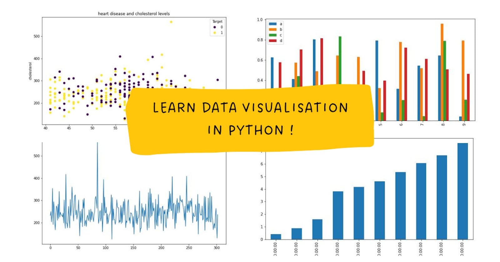
Now let's plot a "scatterplot" with "age" as the x-axis and "cholesterol" as the y-axis: fig, ax = plt.subplots(figsize = (10, 6)) scatter = ax.scatter(x = over_40['age'], y = over_40['chol'], c = over_40['target']); ax.set(title="heart disease and cholesterol levels", xlabel = "age", ylabel="cholesterol"); ax.legend(*scatter.legend_elements(), title="Target"); The output will be something like that :

Let's take the previous code step by step:
first we create a figure and an ax using the subplots function, a figure can hold one or more axes, then we scatter the points with the scatter method, then we set the title, xlabel and ylabel of our ax, and finally we add the legends to our ax.
We can also plot the data directly from our dataframe, for example, to plot a histogram of the cholesterol :
heart_disease["chol"].plot.hist(figsize=(10,6))

or :
heart_disease["chol"].plot(figsize=(10,6))

Finally ...
This is a very simple tutorial intended to give you the basics to get started with data visualization in python for your data science projects, in the next tutorials we will see more advanced topics, stay tuned! thanks!


